Feedback Forum
Topic: Your thoughts on the artwork for 'The Cure'
Topic: Your thoughts on the artwork for 'The Cure'
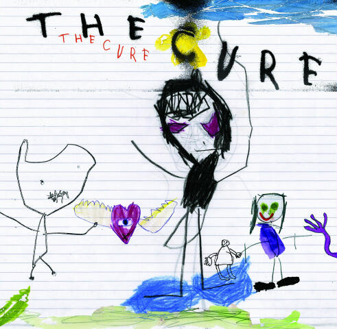
Someone earlier brought up something very interesting
about the artwork that also made me think of something
that Robert mentioned. Notice the fact that
all of the figures are drawn to a different scale, that some of them are
stick figures while some of them are more
defined in the leg regions, eyes, hands, feet, et cetera. Remember also
that "[Robert] gave them all the chance to
submit something". I am wondering if this picture is done by more than
one person, if somehow it is a collaboration
effort of all his nieces and nephews. It reminds me of an "Exquisite
Corpse" style rendering, where one person
will draw a figure, fold it in half so that the next person can build upon
their interpretation of the previous drawing
until you come up with this very surreal (and sometimes cerebral)
piece of artwork. I also like how the long
purple hand pokes through the sides of the cover, it makes you wonder
what is at the other side of the picture.
I found it curious that there are only 4 discernible figures in the picture
versus the five members of the band. (Unless
the purple heart with wings is supposed to represent a member-
Perry maybe?) All in all I think that the
whole cover was done as a collaborative effort.
- Michaelryan Hicks
i like the cover but am very empress with the
single!!!! remember that the cure is like a painting when you look at
it you might not understand them well for
the new comers that is, hopefully the true older fans understand them
rather than just posters and pictures,but
remember what the cure is is music to some who see the cover at stores
may think "ahhh i not going to buy this disk
cause of the cover" but if you look inside and listen to the music then
people well understand what the cure are really
about and that is why i like the cure cause they always made
beautiful music even if it is understandable
and sometime not so understandable with the cover almost like a great
book!!
- Douglas Flores
Initially, when I first saw the new artwork...
I was both shocked, as it was totally unexpected..and dissapointed.
Not really because its awful, but once I read
that Porl had done some guitar work on a couple songs, I had hoped
maybe they had initially contacted him to
do some album art and wandered into the studio... so was hoping for a
Porl cover.
To me the album cover looked very Cure.. but
thought it would be something that would be the cover of a tribute
album or the likes..ie.. someone emulating
the cure.. (if that makes sense)..
But, it has grown on me, and I dont know how
young the child was that drew it, but the logo is fantastic... Fits in
line with all the logos of past. I am
curious to see how the art is going to be carried out throughout the singles
etc.
In the whole scheme of things, I wouldnt care
if it was a plain white label with nothing on it, as its the music that
I
am most looking forward to...and what is most
important... I hope that the cover art doesnt turn off the casual
buyer is all.
Speaking of packaging... I am *Very* happy
that they are including a deluxe version with a 30 minute making of
video. Something they have never done
before, and I think is super cool... definately worth a an extra $5.00.
As for grumbling about different songs on
each album.. Robert has always grumbled about such things as well
and said it was record company's doing..
Anyway, .. now for the video! hehe
- TrentInLA
They are at the point in their careers where
they can afford to be this whimsical . . ., but it does not work for me.
Too contrived. Robert already has an
effortless whimsical nature, why try to affect it, or characaturize it.
"Happily Ever After" (Faith & 17 Seconds
double vinyl), is a great example where Cure whimsical works. That
said, where are my headphones, excuse me while
I listen to TEOTW for the 100th time. (it grows an ya doesn't
it . . .)
- Ryan Sales
At first I wasnt impressed, I actually thought
it was a joke, but after hearing the story behind the art its not so
bad. Its like a old tale "Never judge the
book by it's cover" I dont think they could ever this time around top
"Disintegration" I believe this new album
is going to be very different maybe a mixure of "Kiss Me",
"Disintegration", "Head on the door", &
"Wish". I guess we will see.
- Jerry Ramsey
Whether or not a child actually did the artwork,
I love its execution. It captures a sweet, innocent sensibility that
is still a bit cracked, a bit tempered with
darkness. There are some albums by the Cure that paint your mind in
indelible markers. It's nice to see them breaking
out the crayons this time.
- Michael Chmielecki
I love it!!!!!! I think personally that using
your family and having that innocence makes it all the better. It
is
such a great idea and by far will catch a
lot of attention. It would be really cool to see all the singles
and the
other stuff having to do with this album done
in the same way. The cure over the years have had some pretty
crazy and different covers and this just adds
perfectly right in with everything else.Very The Cure.
- Matt Gonzales
I really like the cover art. I just like
how Robert's visual image in both artwork and videos has gotten
progressively nuttier and trippier through
the years, and with this he's found a way to push that to yet another
extreme. Only Bloodflowers art was a
disappointment in that respect but even that grew on me when I noticed
this - you have to try it - take a piece of
paper or something else with a straight edge and completely block
out
the left or right half of Robert's face on
the Bloodflowers cover. Now do it with the other half. Two
schizophrenically different moods in the same
photo!
- Justin Budinoff
To my opinion this cover design is one of the
best the cure ever had. It reminds me a bit of the primary artwork.
What I think to be very cool is that the name
"THE CURE" is written two times. I don't think this has ever been
done before, although there are a lot of bands
with self-titled albums. I've been waiting for an album just named
"the cure". Simply perfect. I can't wait to
hear the new songs. And this artwork makes the waiting more difficult
to me.
- Martin Pieters
Bright, dark, mysterious, playful, cracked,
sweet, scary, joyful....everything that is CURE. When I saw it I
jumped up and screamed with joy! This
cover is fantastic. Thank you Robert!
- Shari Welch
Im going to have to give the kid a fat F for
effort. Obviously, Robert scares the crap out of this kid or he
wouldnt be portrayed as Mr. Alien Demon from
flying candy heart land. Hey kid, why did you put the time to
give the ugly fat stick figure in the background
hands and none to Robert? You have issues, and next time, keep
the green snot out of your characters eyes.
Dont waste your parents money with art school.
- Ryan Davidson
I adore the new artwork, and think it's hilarious
that so many people are bothered by it. This means that it evokes
strong reactions, and is not just neutral
generic art. They could have done the swirly pinwheel cover, and that
would have been nice, but too placid, too
predictable. I love the swirly art, though, and hope that they do use it
somehow. Anyway, this cover is not just your
average kiddie refrigerator art, as some have mentioned; it's much
more than that. Embedded in this art is the
whole concept behind the Cure's music: the whimsical and sometimes
disturbing darkness, the raw vigor, the playful
and subversive eccentricity. That a child did it is touching beyond
words and shows the depth of the Cure's devotion
to stark innocence. It's simply brilliant, and encapsulates who
and what the Cure are, past, present, and
future.
- Alison Ross
Of course it's something really original. Yes,
a draw by a child is not the best we could expect, so the first time i
saw it i thought it was horrible. However
if you see it very well, you could understand it's something very very
Cure... A dark man on the center,...that child
on the right who seems he's killing another one with a sword... It's
so funny, ambiguos, inquietant... strange.
It's really Cure!
- Giuseppe Massari
I agree entirely with Andrew Griffith's comments.
I beleive many Curefans look for any excuse to put the band
down and this artwork is the latest way for
them to express their dissatisfaction with the 'newer' Cure material,
since Wish infact. These fans need to take
a long look at themselves and really question why they continue to
call themselves a fan of The Cure. Of course
you cannot possibly love everything the band produce but the
negativity, particularly towards the current
line up and everything they have done is really tiring and has become
very predictable. Its these fans who have
lost their feelings towards the group, not vice versa. I suggest they go
and work for the NME as their talents are
wasted on here and on various Cure message boards on the
internet....Anyway, my thoughts on the new
artwork...well at first I did not like it, my initial thought was 'its
ugly',
however it then dawned on me that one of the
reasons that makes this band the best in the world is that they do
things in their own uncompromising style and
never sacrifice their creative genius for the sake of pleasing the
masses. Quite to what extent their artwork
has to do with that statement I don't know. However I do beleive
Standing on a Beach is the biggest selling
Cure album of all time and if you're a non Curefan the artwork could
be considered hideous...in the end its not
the cover that counts, its the music thats within. I kinda like this new
artwork, its messy, its carefree, and so unfashionable
that in many respects it fits in perfect with everything that
The Cure have ever stood for. In that respect,
its brilliant...but lets wait for the music.
- Tom Johnson
I cannot believe how bad this is. Very disappointing. Hope the music inside makes up for it.
- Keith Redmond
First a response to this...I also would like
a change of title,it sounds to easy and too mainstream for the Cure to
have such ameaningless title. Curefest is
also one big "blah", I want my three hours of pure cure goodness
Get over yourself......be grateful that they
are even playing live in your country, spoiled whining brat much....
but....anyway, i love the album cover, so
innocent and naive which is perfect as when i think of the cure i always
think of excitement and feeling alive and
full of hope, this is what this cover inspires in me....love it, love the
new
single, love the cure...enuf said really i
think.
- Alastair Ross
I can`t see why on earth anyone likes the cover
because it (perhaps) is done by a child. Why is it more interesting
because a child made it ? How can that be
a reason for liking it ? What counts is the RESULT and not the process
behind - at least that is how I see it.
The cover is fresh and interesting, but not
that nice or good-looking. I am happy that the guys try out new stuff
and I think that should really be applauded.
But just because it is new dosen`t by definition mean that it is good.
But all in all the cover could have been much
worse - like Bloodflowers...
- Skaanning
The new album cover PUZZLES ME really, i wonder if it has to be with the lyrics.
It is a nice detail that Robert has left to
someone of his nephews doing it, very funny how Robert looks in the
drawing , though i will remove the stripes
of the paper sheet. It reminds me a drawing book page.
This will be The CURE's weirdest album
cover ever. I think it's a like a kind of mixture between WISH
& BF
covers. Since "The CURE" is a very ambiguous
name for an album, i would give the nickname of the "Children
album". But above all, I DO LIKE IT.
- Jorge Luna
Is this Robert in the middle ? He looks like
a Pokemon ! Well I really love this cover, it was unexpected. Tortoise
used to have a similar CD cover (for the "TNT"
album in 1997)...
- Jerome Cousin
After the awful album covers for WMS, Galore, Bloodflowers and GH this one is really cool. I like it!
- Antti Hietamäki
I love the cover for the new album. It
is such a Cure thing to do. To have a child draw their vision of
The
Cure is amazingly cool. Even if the
drawing has been touched up or refined by an adult, it is still the childs
ideas
that shine through. Not to mention the
fact that it is actually an interesting piece of work on its own merit.
She
has included some very interesting emotive
characters. Leaving it on the lined paper speaks volumes as well.
The emotion and heart put into the work carries
so much more value than the technical skill or materials used to
create it. All children are good artists,
because they are care-free and innocent. They arent caught up with
what
other people are going to think, until we
teach them to care. I think that is what Porl tries to do with his
work and
that is exactly what is captured here.
I cant wait to see the entire CD booklet, and to see the 12 vinyl version
sitting on the shelf of a record shop.
- John Peterson
This is a great album cover- very unexpected
and original. There are so many obscure album covers that were
designed to get the people's attention that
it has almost gotten boring. I think the album art is gutsy and i
appreciate its honesty and simplicity. Plus,
think how great it is that there is some little kid out there who, in 15
years when they can really appreciate The
Cure as much as we do, gets to say, "hey, i created the artwork The
Cure used for one of their album covers all
those years ago." I love it.
- Becky
The Cure has always represented the most unique,
bizarre, and typically skewed music around for the past
twenty-five years or so; the fact that the
new album artwork is so bizarre and silly looking is a perfect fit for
their standing in the world of musical significance!
Robert Smith's non-conformist ways continue with unbridled
fury. In other words, I love the artwork
(BTW - the cover artwork for the "Primary" single was my favorite
Cure artwork before this album; the new album
artwork is now my fav.).
-Daniel Mitchell
Bottom line: When the lights go out (whether
at home or the show) and the music begins, the songs paint the
canvas in the mind.
- Michael Falgout
Well, for me it's like a big joke. Of course
it's a very nice drawing if you like childrens. But in a graphic point
of
view, the new artwork does not have any interest.
And when I think about the brilliant works of Porl thompson,
I'm expecting for something more "creative",
or interesting. Because the choice of a "naïve" style is a little
bit
"old fashioned". Maybe they choose to make
an artwork "atractive" instead of "arty". But, if they 're looking
for artworks for the singles, or for limited
edition, My brother's daughter is very talented (she's 4 years old), and
i'm sure she's able to make some nice drawing.
Anyway, the most important is the songs....
- MC soixante quatre
I like it a lot. In fact, I like it so much
that I rank it as one of their best album covers. I have always been
fascinated with the children art. It's so
honest and innocent. No wonder why the kids from all over the world draw
almost identical shapes of the things/persons
they see, but the interpretation of their drawings is very deep and
tough. Every detail or shape usually represents
some emotion, observation or a perception of the world. Still, it's
the music that matters. If it turns to be
great, I will consider the artwork as their best one!
- Ivan Jekic
I must say that Robert and the guys have yet
again stirred me up into a massive Cure-frenzy(it always happens
right before they release an album). The album
cover art is a wicked simple idea. Fun....child-ish.....original.
Brilliant that Robert and Porl are getting
their family involved. To those who have complained about the album
cover, SUCK IT UP!!! It is an amazing concept,
and come on people it was done by a four year old. Give
he/she some credit. And haven't you
learned the expression 'It doesn't matter whats on the outside, all
that
matters is whats on the inside'? The
music is ALL that really matters. I am going insane waiting for the album
to
come out, and even more insane waiting to
see them again. The new songs i have heard are fantastic, i can't
wait
to hear all of them.
- Nando Arimare
I love the new album art work, it's original
and it actually makes me happy... makes me feel happy... sort of like
a kid drew me a picture, and that is one sense
of innocents that brightens my smile from a child... so--- the new
album definatly shows a sign of youthfullness...
i haven't come acoss an album like this before.... i love it!
go cure!!!
- Kathy Zaleski
When I saw the album cover all I could do was
laugh, not meaning to laugh at it but laughing because it was just
an enjoyable artwork to look at, and just
funny looking. I had no expectations as to what it would look like. Alot
of people might complain about it but in defense
of prior albums, what covers have been 'normal'? I would say
only Bloodflowers and maybe Wish have a 'typical'
album cover compared to what other bands put out. It could
be worse, Robert Smith could be holding a
old machine gun on the cover!
- Ken McClain
Honestly, my first impression was 'Ok, not
again, more simple artwork'. But whatever the new album cover may
be, I will still buy it. I do like the
'Robert' figure (the more I look at it, the funnier it gets). And,
if that is Simon
on the right, I like it too! I agree
with some of the others that it's the music that counts. I am anxiously
awaiting
The Cure's new album release on June 29th.
- Karen Beard
Love it. It is original/different plus
I dont really care about the cover just the contents of the album.
I was
thinking the band doesnt have any major label
telling them what the cover should look like so this is what we get.
I just wish it made from Robert Jr. Hopefully
his wife will change her mind about having kids so he can take over
the Cure.
- Albert Ruiz
Well, I was just as surprised as anyone else.
But, I like it. It almost looks like Porl did the artwork. Besides, it's
The Cure. A lot of people didn't like the
cover of Wild Mood Swings either. I think its cool.
- Brandon Neil Ragan
I think people forget that TheCure never been
followers of the mainstream, thats what makes them so speacial.
Robert is pushing the group in a new direction,
with new ideas. Seems all these people who are upset before they
even listen to the entire album, would be
the same people who would hang Galileo in the 1600th century for saying
the world was not flat. I was at coachella
and got to listen to "lost" live, this song will give you the chills.
- Ignacio Salas
By far, it's a leaps-and-bounds improvement
over that dismally amateur Bloodflowers design. The new artwork
is consistenly "Cure-ish". It has a breezy
simplicity and childlike mischief that evokes former designs like
Boys Dont Cry, 3IB, the Bananafishbone logo,
Japanese Whispers, Wish-era doodles, Caterpillar sleeve, and the
innocence of the Head on the Door and Kiss
Me singles. Im very interested in seeing how they carry this theme
forward with promo displays, tour shirts,
singles' artwork, and other marketing collateral and promotional
paraphernalia. We could be in for some visual
fun this summer.
- Stephen Coviello
I must say that in my opinion it is a strong
cover. Not only for the childhood implications that where already
explored in this forum, but because it lead
us back to the begining of the band. "If you don't like this album, then
you don't like us". This is an album back
to the raw Cure soundscapes(so I read and so I heard so far). They went
in the studio and recorded it in a pretty
similar way they did in the begining. The childish drawnings make a strong
impact by the contrasts, colours and the dark
figure of Robert in the center, the light artwork vs the album's
content , which is profound Cure music (the
ones I heard so far). Maybe some are not confortable with the
artwork, averse to it, and just maybe, this
was intentional. Are we going to get the album because we like the
cover or because we wanna experience the music
? Think about it. When I first looked at it I immediately thought
it was one of Robert's nieces or nephews who
did it and, the gutter reaction was : Brilliant ! I don't know if it was
Porl's kids or himslef, if it was Porl, Congrats
on the shock. If it was one of his kids who did it, another artist in the
family is on the way. Now, artwork oppinions
apart, we should focus on the music, and experience this album as a
whole entity instead of considering just its
cover. If you heard the songs and you don't like them, it is OK,
everyone is entitled to their own musical
taste, but, for music sakes, don't go as far as not listening to it just
because you don't like the cover, right ?
- Julian R. Knihs
At the end ofthe day it's all about music, that is why we are into it.
- Davide Consoli
I think with a self-titled album The Cure are
now really saying "Yes this is us, love us or leave us" and for me
that's quite possibly part of the intention
with the artwork. In at least the British music press (who are ALL
shit
incidentally) there's a tendency to present
The Cure as childish and the band that never grew up, despite making
some of the least childlike music available,
and I would bet my final Pound coin on every British review mentioning
the artwork as being part of the childishness
of the band and typical of their "usual" swirly cover art.
In a way it could be the band pre-empting what's
going to be said about the new album and beating everyone to it,
while also letting everyone know that they
don't give a shit what people think........or it could just be a piece
of fun
artwork!
On a more personal note, what I really love
about this picture is the contrasts between two of the characters. The
Robert figure in the centre looks very stern,
serious and in control.....while the character to the right with the blue
"clothing" (which MUST be Simon!!!) looks
like he's having an absolute blast with his cheeky grin and mad
posture !!!
Overall, until I hear the album I can't say
if the artwork fits the mood, so that remains to be seen - but hey it's
gotta beat another album cover with only Robert's
face peering out, which goes no way to convincing the public
that The Cure is more than just Robert. At
least this make them looks like a proper band, albeit with very
stick-like forms !
- Dave Ace
I think people should give it time. I think
the artwork is much better than Bloodflowers which looked really
amateur (when they were not trying to be).
This seems to be more unique. If what Robert says is true - that
this
album represents a new beginning - then this
artwork seems quite appropriate (like a second childhood).
- Jeff Hessel
I have a hard time believing that anyone who
would call themselves a Cure fan would knock the art for the new
album. Particularly those "fans" who refuse
to acknowledge the merits of anything newer than Wish. Some of
the strongest themes that have surfaced time
and time again throughout the history of The Cure are those that
deal with childhood and leaving behind the
innocence and wonder that one can only experience with youth. The
new album art echoes these same themes in
a strangely "Cure" fashion. And it is an even more appropriate
cover if this album is to be what everyone
is claiming it to be, The most "Cure" album yet. The fact that they've
used what seems to be a child's impression
of The Cure is very fitting for the idea of an album free from any
attempts at anything more than what it is.
Of course anyone who has lost that childhood innocence or the longing
that accompanies the loss of such innocence
might not get the cover, and for that matter they probably don't "get"
The Cure. Perhaps that's why so many people
don't like the newer Cure stuff, because when they heard the old
stuff so long ago they still had that feeling
but have since lost it and haven't experienced it with the newer
material. On the other hand I must admit that
I have plenty of my own preconceived notions regarding The Cure's
music and album art and must admit to a feeling
of uncertainty with each new song and album cover's introduction
but when I let it sink in it always seems
to grow on me in a lasting way.
- Andrew Griffith
I like the concept, just not the execution,
I suppose. A simple, child-like drawing could work as a Cure cover
(think: Wish) . . . but not one with flying
hearts, yellow stars, and smiling girls, not to mention a poor Robert
Smith (?) caricature. All will be forgiven
if the album is good, though. (I was going to buy this one in stores,
but
maybe now I'll just download it off iTunes
and skip the cover art.)
- Andrew Figel
I think it is very doubtful that it's actually
done by a child. The figure on the leftmost, the "heart-thing", and the
hand on the right are all quite distinctively
"Porlish". It's most evident in the head of the figure on the left.
Clearly his lines. I suppose you could say
that his kids have maybe been exposed to his art a lot, and are his
offspring, but still, it's just a bit too
good all together. In my opinion.
- Jani Jalavisto
I love the new art work. I think it will stand
apart on the shelf. I don't think cure fans should be so negative (not
just about this artwork) it obviously means
something to Robert. Everytime the cure push new grounds fans
complain that its not pornography, disintegration
and so on. Come on people, this is one of the things that make
the cure so great, there ability to change
and do it brilliantly! Even if its a dumb pop song somehow its still good.
I have respect for everything they have done,
even wild mood swings. My one complaint is that they will record so
many song tease us with that number then only
release 11-12 or who knows. Please give them all to us!
- Brandon Flyg
Ok...am i gonna have to be the first one to say this....
does this mean that this self titled will now forever be remembered as...
"The Kiddie Album"???? :)
- Eugene Blankenship
After hearing the new single and then seeing
the artwork, i am certain: i am over the cure. it hurts me to say this,
knowing how much i love everything up to and
including wish, but i haven't liked anything in 12 years.
my fingers are crossed for the rest of the
album (the parts i can buy in america, that is).
- Scott Otto
If the story about nieces/nephews is true then
surely it shows an artist who is relaxed and confident about the
material on the new album. Does the artwork
matter that much?
- Matt Haynes
I really like the album cover artwork.
It gave me chills when I first looked at it. As seemingly sweet and
silly as
it is, it is also very haunting. For
me, it invokes a feeling of "old school" Cure. I hope the forthcoming
music
reflects as such.
- Tim Cummings
I dig it. If it really was done by a young
child or several children, I think that's cool. Has that ever been done
before? It goes along with the whole Cure
sense of humor, especially with so much importance and fan-pressure
being placed on the artwork it's a great piss-take
to turn it over to a child. And admit it, it's just neat.
- Jordan Livingstone